SNACK three-line summary
- This dev log focuses on the editorial workflow from news collection to post visibility.
- AI news, vibe-coding dev logs, hashtags, and dashboard screens were separated by role.
- The lesson is to tell AI where the workflow is confusing, not only to ask for a prettier screen.
Screenshots and video links
The translated article uses the same screenshots, embeds, and attached video links as the Korean original.


Snackgirls editor note
- Nea — The useful change is structural: categories, tags, list conditions, and dashboard feedback all need to match the reader's expectations.
- Red — A post being published is not enough. If it lands in the wrong place, the whole editorial desk tastes burnt.
- Kirari🌟 — Characters work best when they guide the reading angle. They should add flavor without covering the work screen.
Why this log matters
The first dev log fixed a sticky-post problem on the front page. The second one moves from a single display issue to a repeatable editorial workflow for Game Sunakku. The core question became how to collect news, choose topics, write posts, publish them, and confirm that they appear in the right place.
AI news and dev logs were separated
The first problem was that AI news appeared inside the vibe-coding dev log area. That was not just a visual issue: readers use categories to judge what kind of article they are opening. The AI page was reorganized into two branches so AI news and development logs could be found separately.
Hashtags became a path, not decoration
The original article notes that hashtags were originally just text. The better request was based on reader behavior: when someone clicks a hashtag, show posts with the same hashtag, keep the page clean, and do not make it slow. That turned hashtags from decoration into a route to the next article.
Dashboard workflow changes
| Problem | Change | Why it matters |
|---|---|---|
| AI news appeared in the dev-log area | Split AI latest news and vibe-coding dev logs | Readers can understand article type from placement |
| Hashtags were plain text | Clicking a hashtag shows related posts | Tags become navigation to the next article |
| Dashboard had many buttons | Show lists and next actions first | Editors can see what to do next |
| Heavy data loaded too early | Use lighter loading and fetch details when needed | The workspace feels faster and cleaner |
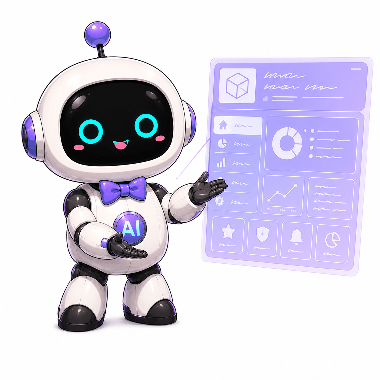
Snack Girls as editorial viewpoints
The article defines the characters not as simple mascots but as viewpoints in the editorial system. Red handles long-form WordPress writing and interpretation, Kirari🌟 looks for save-and-share points, and Nea handles search-friendly facts, summaries, structure, and automation. The public framing is kept as Game Sunakku editorial roles.
Design restraint
A character background was tried in the dashboard, but it reduced focus. The final direction was to remove large background art and keep small icons or badges. The dashboard is a work surface, so the work needs to remain the focus.
Prompt lesson
The strongest lesson is that asking AI to make something pretty is too vague. A better request names the confusing point, the expected next action, and any performance condition. For example: show where a queued topic went, reduce explanation, show the list and next action first, and load heavy data only when needed.
Conclusion
Game Sunakku started to move from a blog that publishes articles into an editorial workspace that can keep producing them. The practical takeaway is simple: automation does not end at posting. It also has to place the article correctly, make links useful, and show the editor what to do next.
Sources and check date · Based on the original Game Sunakku article. Checked: June 6, 2026
Leave a comment