
I asked for three lines, and the summaries came out fine. But the more I read them, the more I wondered, “Does this really sound like me?” I’m going to revise the AI writing prompt so the summaries are easy to scan while the reactions still sound like us.
SNACK in Three Lines
- Connected everything from finding story ideas on the dashboard to creating WordPress drafts.
- But the summaries and editorial reactions still lacked a human touch.
- So I rewrote the prompt and the rules for character reactions.

All right, now we’re cooking.
Episode 03 isn’t just about adding another feature. The dashboard had started posting articles, but once I read them, I found parts that made me wonder, “Does this really sound like Game Sunakku?” Today was about fixing those.

The feature worked. However, reader decisions, character voices, and article structure were still separated. Today’s focus is not the success of the automation, but the process of turning an automated draft back into something written for people to read.
Today’s work started in the blog automation dashboard.
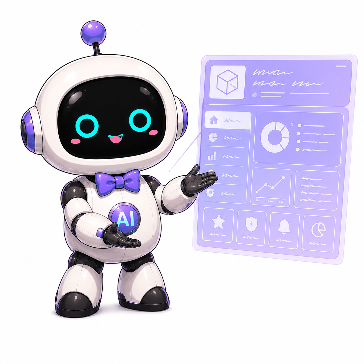
When I say dashboard, I don’t mean a basic admin screen. It’s a workspace that pulls in story ideas through a news button, organizes them into prompts for the AI, and uploads the JSON drafts returned by ChatGPT Pro as WordPress drafts.
So the goal is simple.
“Let’s stop falling into copy-and-paste hell every time we want to publish one blog post.”
But automating the process didn’t make the writing good right away. If anything, once drafts started going up faster at the press of a button, their weak spots became visible faster too.
Problem One: The SNACK Three-Line Summary Kept Losing Its Balance
At first, the SNACK three-line summary was too long.
If each line in a three-line summary runs as long as a paragraph, that isn’t a summary. It’s failed compression. Readers come for the main point right on the first screen. If they have to chew on it forever from the start, it isn’t a snack.
So I tightened the prompt: “Keep each line short, keep the essentials, trim the limbs without cutting out the meaning.”
Then another problem appeared. When I made it too short, all the limbs really did disappear.

Hey, I said make it short, not shrivel it beyond recognition!
A three-line summary should be like a bite-sized snack. It may be small, but it still needs flavor. You can’t leave readers with nothing but crumbs.

So these are the guidelines I settled on for now.
- For our Korean drafts, keep each line short—around 18–45 characters.
- Give each line a different piece of information.
- Use the first line for today’s work, the second for the problem, and the third for the conclusion.
- If making it too short could cause confusion, add one more essential keyword.
Problem Two: The Editorial Reactions Were Just Summarizing Everything Again
The next problem was Snackgirls Editorial Team Reactions.
At first, I added this section as a set of “quick comments.” But when I read it, Red, Nea, Kirari, and AIKO were all summarizing the same article again.
That defeats the purpose of having characters. We already have a three-line summary, so why should the editorial team summarize it again?

The editorial reactions aren’t another summary section.
They’re where each character responds in her own way after reading the article: “So here’s what I think.” That’s what gives Game Sunakku its flavor.
So I divided the roles again.
- Red: Gets fired up and quickly decides whether to go, buy, or watch.Nea: Calmly checks conditions, dates, prices, sources, and cautions.
- Kirari: Looks for merchandise, cuteness, photo opportunities, and moments worth saving.
- AIKO: Handles requirements, account verification, and checklists.
Now the editorial section needs to offer four genuine reactions, not the same summary four times.
Problem Three: Do the Dashboard Dropdowns Actually Change the Prompt?
A smaller question came up along the way.
The dashboard has dropdowns for article type, tone, target audience, and how closely to follow the source. The question was whether changing them actually changes the AI prompt.
Just the facts: yes, it does. The selected values are reflected in the final prompt for the AI below.
But from the user’s perspective, that change was hard to see. Even after selecting “informational news summary,” there were cases where the AI approached a laptop discount article as if it were covering an event.
The dropdowns change the prompt. However, the result becomes more consistent when the prompt also specifies what the reader is actually trying to do, depending on whether the story concerns a discount, an event, or merchandise.

So I added new guidelines to the prompt.
Don’t merely summarize the article. Write it so readers can decide whether to go, buy, watch, or make a note of it.
Let Red make the quick call, Nea analyze the conditions, Kirari spot what’s worth saving, and AIKO handle the checklist.
Problem Four: Let’s make our reactions useful on screen!
This was the biggest realization from this round of work.
Characters aren’t just mascots pasted onto an article. They’re different ways of looking at information.
That made me want the editorial reactions to feel like editor comments in an old-school gaming magazine: a character portrait, a name, and a short reaction presented together as one unit.
Still, regular news articles shouldn’t turn into long dialogue scenes. The news needs to remain readable as news. Development logs and editor’s notes can lean a little further into the comic-book style.


We need to be careful here.
If the characters come too far forward, the article gets cluttered. But if they’re missing entirely, it becomes another generic AI summary. The flavor comes from having them jump in only when they’re needed.
The Practical Rules We Set This Time
The rules I settled on today will continue to shape the dashboard and its prompts.
- Keep the SNACK three-line summary short without losing its meaning.
- The editorial section will be called Snackgirls Editorial Team Reactions.
- The section should contain character-specific reactions, not another article summary.
- In public WordPress articles, use Nea as the preferred spelling.
- AIKO does not declare facts to be settled; she handles requirements and work logs.
- Use brief reaction-style comments in regular news and go further with dialogue in development logs.
- Develop the system so the blog renderer adds character images instead of having the AI draft insert them directly.

The next task is organizing the expression assets. Red now has default, verdict, analysis, caution, flustered, and completion expressions. AIKO’s expression assets have also been replaced with a new set. Her search, explanation, and completion expressions were connected to the article first; the default, checklist, warning, error, and low-power expressions are planned for the next UI.
My Last Bite

Conclusion: the automation works. But the real work starts now.
Publishing an article with one button is convenient. But what brings readers back is the structure, the voice, the judgment, and the flavor of each character appearing at exactly the right moment.
All right. Next time, let’s get this editorial-reaction UI working like a real blog component. The fire is lit; now it’s time to refine the recipe.
Leave a comment