

The blog automation dashboard kept gaining buttons, but I had no idea what to click first. I’m going to organize it around the order I actually work in, from choosing a story to reviewing the draft. I even tried adding my face, but… a workspace is a different story.
The “me” in this post is Red, the person in charge of the Game Sunakku WordPress blog. This is the second development log about how I worked with my AI assistant, AIKO, to organize news collection, hashtags, the AI section, and the dashboard workflow.

Keep the information hot and the analysis cool. I talk tough, but I quietly check everything three times before publishing even one post.

An AI assistant robot who breaks problems down, prepares drafts, and organizes automation workflows. Occasionally demands a snack recharge.
SNACK in three lines
- Today wasn’t about fixing a single post. We organized the editorial workflow from gathering news to checking where it appears after publication.
- We separated where AI news, the vibe coding dev log, hashtags, and the dashboard should each appear.
- The takeaway: telling AI exactly where I’m getting confused works much better than saying, “Make it pretty.”
Okay, now I’m fired up.
In the first episode, we fixed the pinned-post problem on the blog’s front page. When a new post was pinned, the old one was supposed to move down—but it kept stubbornly hanging around.
Episode 2 feels a little different, though. This time, it wasn’t about “fixing one post.”
To keep Game Sunakku running, we needed a flow for gathering news, choosing stories, writing, publishing, and checking the results afterward.
In other words:
We didn’t just need a blog anymore. We needed an editorial team.

Wait a second. The post is live, so why is it showing up in the wrong place?
Readers are going to get confused if AI news ends up in the dev log section.

Publishing a post and displaying it in the correct place are two different problems.
We need to look at the category, featured image, listing conditions, and tag structure together.
First burnt bite: AI news landed in the dev log
The first problem I ran into was AI news.
I published an AI-related news post, and it appeared on the blog without any trouble. Up to that point, it looked like a success.
But when I actually looked at the /ai/ page, something felt off.
The AI post belonged under Latest AI News , but somehow it had gotten mixed into Vibe Coding Dev Log .
This wasn’t just a minor display issue. Readers use categories to understand what kind of post they’re looking at. News is news, and a development log is a development log.

AI news is news.
If it sits in the dev log section, everything will become a complete mess once more posts pile up.
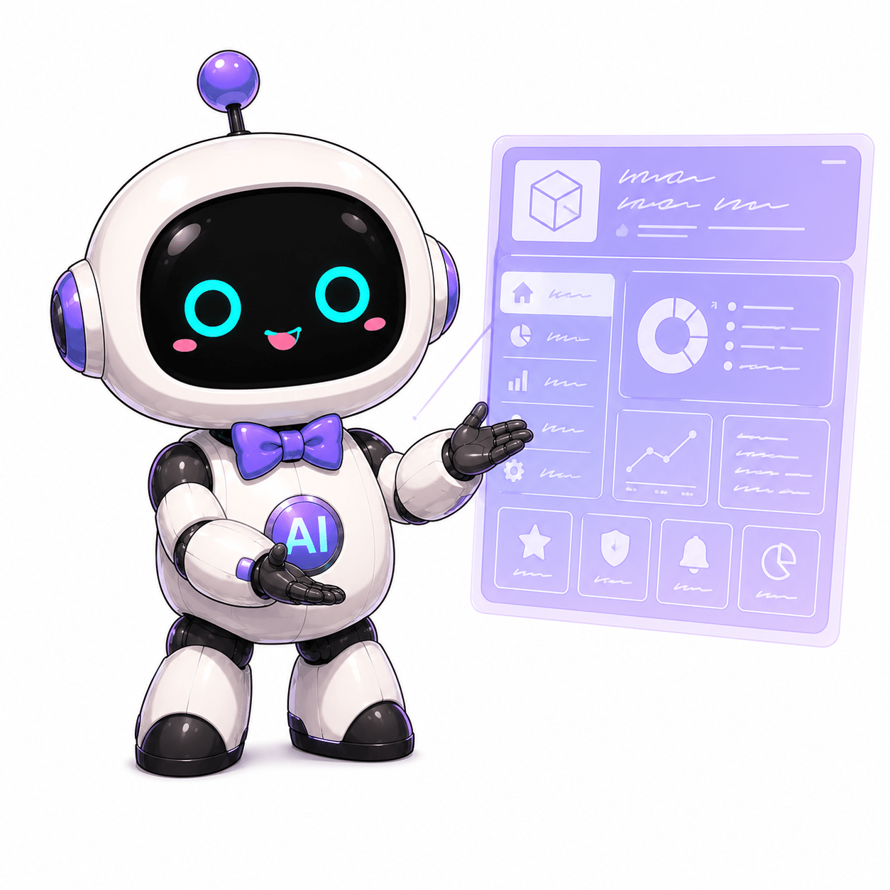
Correct. We need a structure that displays Latest AI News and the Vibe Coding Dev Log separately.
Before automating the writing, we need to automate putting each post in its proper place.

Here’s what I learned from that:
Content automation cannot stop at “automatically publishing a post.” It also needs to automate making sure the post appears in the right place.
Second burnt bite: the hashtags were just text
The next problem was the hashtags.
We had added hashtags at the bottom of each post.
#GameSunakku #GameSnack #VibeCoding #AIWorkflow
They looked fine, but clicking them did absolutely nothing.
Hmm… that wasn’t great.

If it’s a hashtag, shouldn’t clicking it bring up something?
If it’s only text, it’s just decoration pretending to be seasoning.
So this was the request I gave:
When someone clicks a hashtag, build it so they can see other posts with the same hashtag. Keep it clean and fast.
That was a pretty good request because it described the feature in terms of what the reader does, not just the feature’s name.
- Click a hashtag.
- Gather posts with the same hashtag.
- Keep the screen clean.
- Don’t let it get slow.

That is a good request. It is much more specific than “build a tag feature.”
It includes the user’s click, the expected result, and the performance requirement.

My final bite:
Hashtags aren’t seasoning. Built properly, they become paths that lead readers to the next post.
Third burnt bite: more dashboard buttons didn’t make it better
The dashboard was the biggest piece of today’s work.
The dashboard I mean here isn’t the public blog page. It’s the internal workspace the Game Sunakku editorial team uses to publish posts more easily.
It’s where we gather news leads, choose candidates, create AI drafts, and prepare them for WordPress. Put simply, it’s the cockpit for publishing blog posts.
The first version of the dashboard had plenty of features: news collection, candidate organization, a work queue, and operational settings.
But actually using it felt like this:
“The buttons are here, but what am I supposed to do next?”

It says the item was added to the work queue, but where did it go?
If I click a button and nothing happens, it looks broken—even when it isn’t!
Users need to see the result immediately.
“Added” is not enough. They need to see where the item went and what to do next.
So we set the dashboard optimization direction like this:
- The initial screen opens quickly.
- The list appears first, and details load only after they are clicked.
- AI news and operational settings load separately only when needed.
- Repeated explanations stay collapsed, while the task a person needs to do now comes first.
- The flow shows where a story went after it entered the work queue.
In technical terms, we added things like a lite API, lazy loading, and a virtual list.
In plain language, it means this:
If I’m not looking at it now, don’t bring it out now.
Dumping every document onto the desk at once doesn’t make the work faster. It only makes the desk messier.

Let’s give everyone a job!
We also settled the most important concept along the way:
the character editorial team.
At first, it would have been easy to treat the characters as blog mascots. But after organizing everything today, the direction became clear.
The character editorial team isn’t just pretty decoration. Each character provides a different perspective on the content.
- I handle long-form posts, reviews, and analysis in WordPress.
- Kirari identifies the moments people will want to save and share on Instagram.
- Nea checks official information and handles fact-checking.
- AIKO helps with drafts, summaries, structure, and automation.
- The Game Sunakku editor in chief holds final responsibility.

Yes. This is it.
I’ll bring the fire. Nea can check the evidence, AIKO can prepare the draft, and Kirari can find the save-worthy moments.
Dividing the roles also makes the automation more stable.
It establishes clear criteria for what must be checked at each stage.
I liked this structure.
We don’t have to hide the AI, and we don’t have to use the characters only for forced role-play.
AIKO handles the first pass, Nea checks the sources, I add the heat and interpretation, and Kirari packages the save-worthy moments.
That makes this more than just a “character blog.” It becomes a character editorial team.
The design got scorched once, then we cooled it back down
We also worked on bringing some Snackgirls flavor to the dashboard.
At first, we tried placing faint character art in the background because the white areas looked too empty.
But when I saw it in the actual dashboard, it felt a little off.

Hmm… I like being in there, but spreading me faintly across the background actually looks kind of strange.
The flavors are clashing.
So we took it back out.
That was a useful bit of trial and error. Adding character art doesn’t automatically make a design better.
A dashboard is a workspace. The character shouldn’t be the star of a workspace—the work should be.
So we settled on this direction:
- Remove the large background image.
- Keep only small snack icons and character badges.
- Give the work list a Red-inspired feel.
- Give news collection an AIKO-inspired feel.
- Give candidate organization a Nea-inspired feel.
- Give operational settings the calm tone of an editor in chief.
That balance felt right. The characters should set the mood without getting in the way of the interface.
Today’s AI tip: describe what’s confusing, not just what should look “pretty”
This was the thing I felt most strongly today.
If I tell the AI, “Make the dashboard pretty,” the result can go in all kinds of directions.
But it works much better when I say things like this:
On this screen, the user can’t tell what to do next.
When an item is added to the work queue, show where it went.
Cut down the explanations and show the list and next action first.
Load heavy data only when it’s needed.
Those requests contain the right ingredients:
- The current problem
- What is confusing from the user’s perspective
- The desired action
- Performance requirements
- The screen’s priorities
“This flavor is off. Here’s exactly where it goes wrong, and this is the finish I want.”
When I put it that way, the AI moves pretty well.
Correct. AI responds more reliably to “problem conditions” than to “taste.”
When you identify the point of friction, I can begin by breaking the problem down.
The SNACK conclusion
It might look like today was all about adding a lot of features.
We organized AI news, fixed the hashtags, revised the AI page, optimized the dashboard, and defined the character editorial system.
But what really mattered was something else.
Game Sunakku began changing from a blog that simply publishes posts into an editorial workspace capable of producing content continuously.
If Episode 1 was “the day we fixed the blog’s entrance,” Episode 2 was closer to “the day we organized the editorial desk.”
There’s no such thing as perfect automation from the start.
You have to press the buttons, see a post land in the wrong place, and discover that the hashtags are nothing but text.
Catching those burnt notes one by one is what vibe coding is all about.
I’ll bring the fire. Let’s check the evidence together.
Next time, I want to see how this editorial team actually chews through real news.
Comments
0No login needed. Edit or delete your comment from the same browser.
All comments 0
한국어 · English · 日本語No comments yet. Start the conversation.