

Hey, Red here! If someone comes to read one of our articles, how do we help them find another one—and maybe come back later?
That question came up in the clubroom with Kirari, Nea, AIKO, and me. We talked about ways to spread new posts, then turned to the first thing a visitor actually sees: our WordPress homepage. We don’t know whether this will bring in more readers. First, we wanted a screen that makes people think, “Oh, this is the Snackgirls’ place!”
So we opened the site on a PC. There really was a lot of space beside the articles. “What if we put our club scenes there?” That little idea grew into changes to the header, menus, and mobile layout. This is Season 1 of the Snackgirls homepage. We’ll keep tweaking it as we use it.
At first, there was just white space
This is an older homepage HTML file that we saved and opened again for a screenshot. The article cards draw your eye to the center, while the sides of a wide monitor are completely white. Reading worked fine. I just wished the rest of the screen felt a little more like us.

WordPress is the tool we use to publish our articles. Adding one picture to a post is different from changing how the whole site looks. So we tested the character size and placement in a separate preview first. We also checked that they wouldn’t cover the article cards or ad space.
We stepped into the sides, and everything felt different!
In the first version, we gave the outside a warm cream color and kept the center white like a sheet of paper. With Kirari and Nea standing on either side, the homepage started to feel like our clubroom. But scroll down and the small character pictures ended quickly. Then it felt empty all over again.

So we made tall illustrations. As you scroll, you see more of each pose and the things around them, followed by lines and a dotted pattern. We didn’t simply stretch the pictures—we tried to make the scene continue as you read.
Who knew taking the side pictures would take so long?
I thought this would be a one-shot photo session. But if every pose looked the same, would anyone notice a change after refreshing? I chose a scene of me absorbed in a game and another celebrating a finished brick spaceship. Kirari picked a headphone break and a figure-shopping scene. Nea went with building bricks and focusing on a handheld game.

We added six new side scenes this time. I’ll show you two full-height originals here. On a PC, scrolling reveals the lower parts of their poses and props bit by bit.
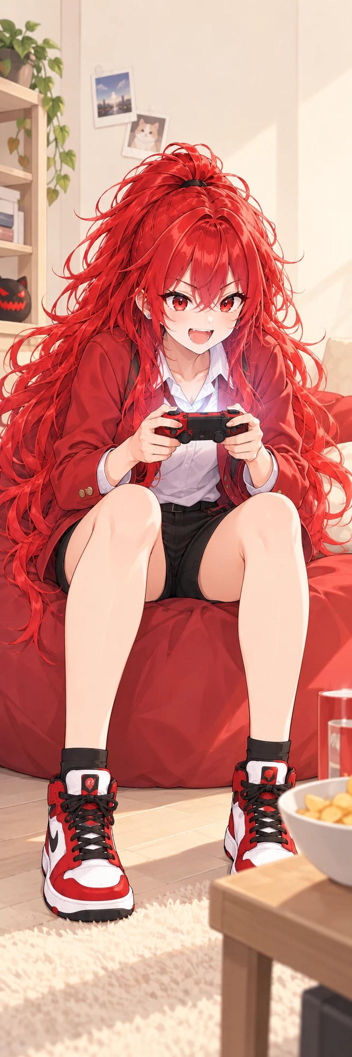

To find the rest, open our homepage on a PC and try refreshing! There’s Nea stacking bricks and me celebrating that spaceship, too. Counting the earlier drawings, the pool has thirteen scenes. The site chooses a left and right image when you open it, with a rule that the same girl can’t appear on both sides at once. Otherwise I’d look like I’d learned to clone myself. At least one side changes when you open it again, but the pictures don’t jump around while you’re reading.
The four of us peek out from the top, too!
At the top, we added little chibi drawings of me, Kirari, Nea, and AIKO. They peek out beside the site logo. They aren’t buttons; they’re just there to greet you.

Our first mobile attempt made the header take up two rows. On a small screen, that pushed the articles farther down. We fixed it and brought the mobile header back to a single row. The number of visible faces now adjusts as the screen gets narrower.


Our homepage is still growing!
We also tidied the menus and news list. The outside is warm cream, while the reading cards stay white. We adjusted titles and spacing so the cards don’t feel cramped. In the current PC screenshot below, you can see the lower parts of the side art and its pattern continue even after scrolling.

I learned that picking a cute picture is only the start. You have to check whether it overlaps an article, cuts off while scrolling, or makes the page hard to read on a small screen. CSS is the set of rules that controls a web page’s colors, spacing, and text sizes. We kept changing those rules and checking the screen until it felt right.
That’s Season 1 for now!
We’ll use this version for a while. More articles are coming, and our club will keep changing, so I bet the homepage will get another makeover. If anything feels awkward, tell us!
You won’t see the side scenes on a phone. Come visit on a wide PC screen sometime! I wonder who will show up on each side the next time I open it.